Political Infographics
As a country we pride ourselves on diversity and being very progressive on women’s rights. We’d like to think that the gender gap is smaller here then other countries like Afghanistan…. but when we look at the data is it true? Here are some interesting infographics about the representation of women in government:
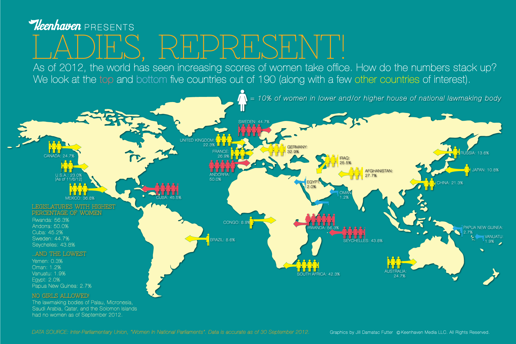
Where do we stack up globally?
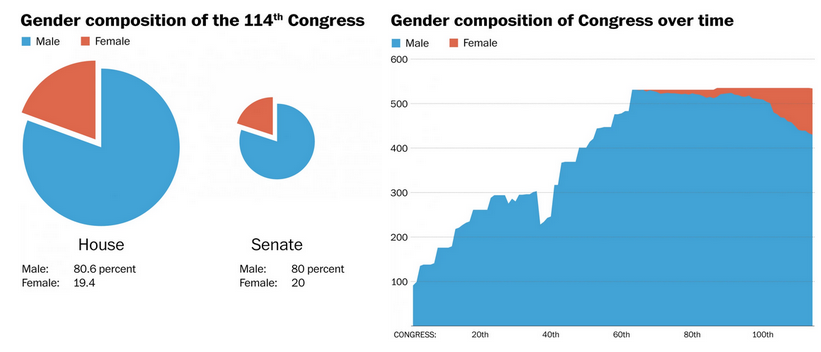
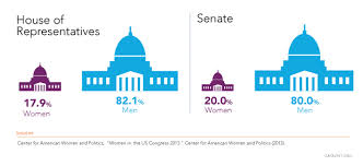
What do the numbers look like at the federal level?
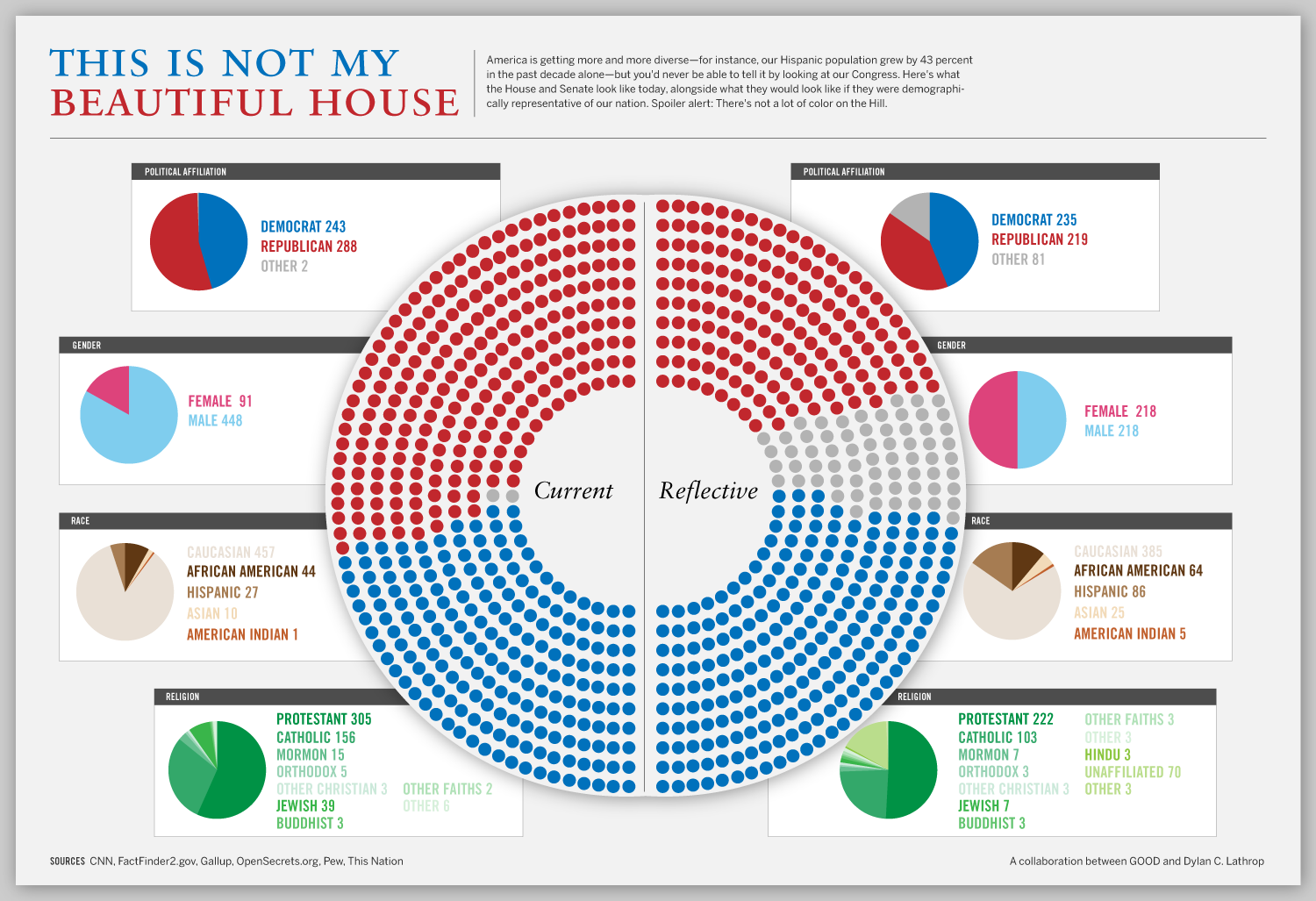
What does it look like in reality versus what would it look like if it was truly representational?
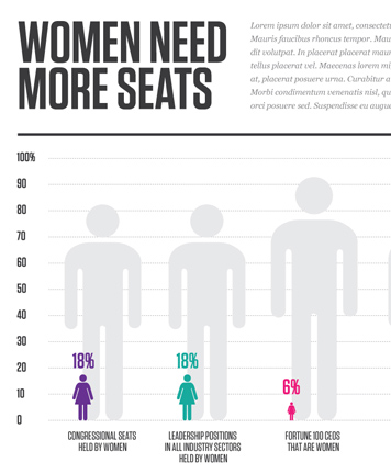
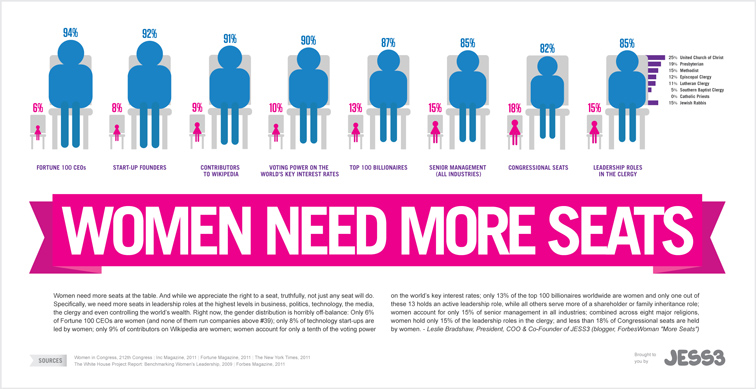
I think that just as recent Forbes article, “Why Women Havign a Seat at the Table is Not Enough,” it is definitely a place we need to start at:




Recent Comments